IQ Community Map
More Insight. More Power. More Impact.
The Community Map in the LibraryIQ Platform is designed to give libraries a clearer view of who they serve, where services are making an impact, and where there’s still work to be done.
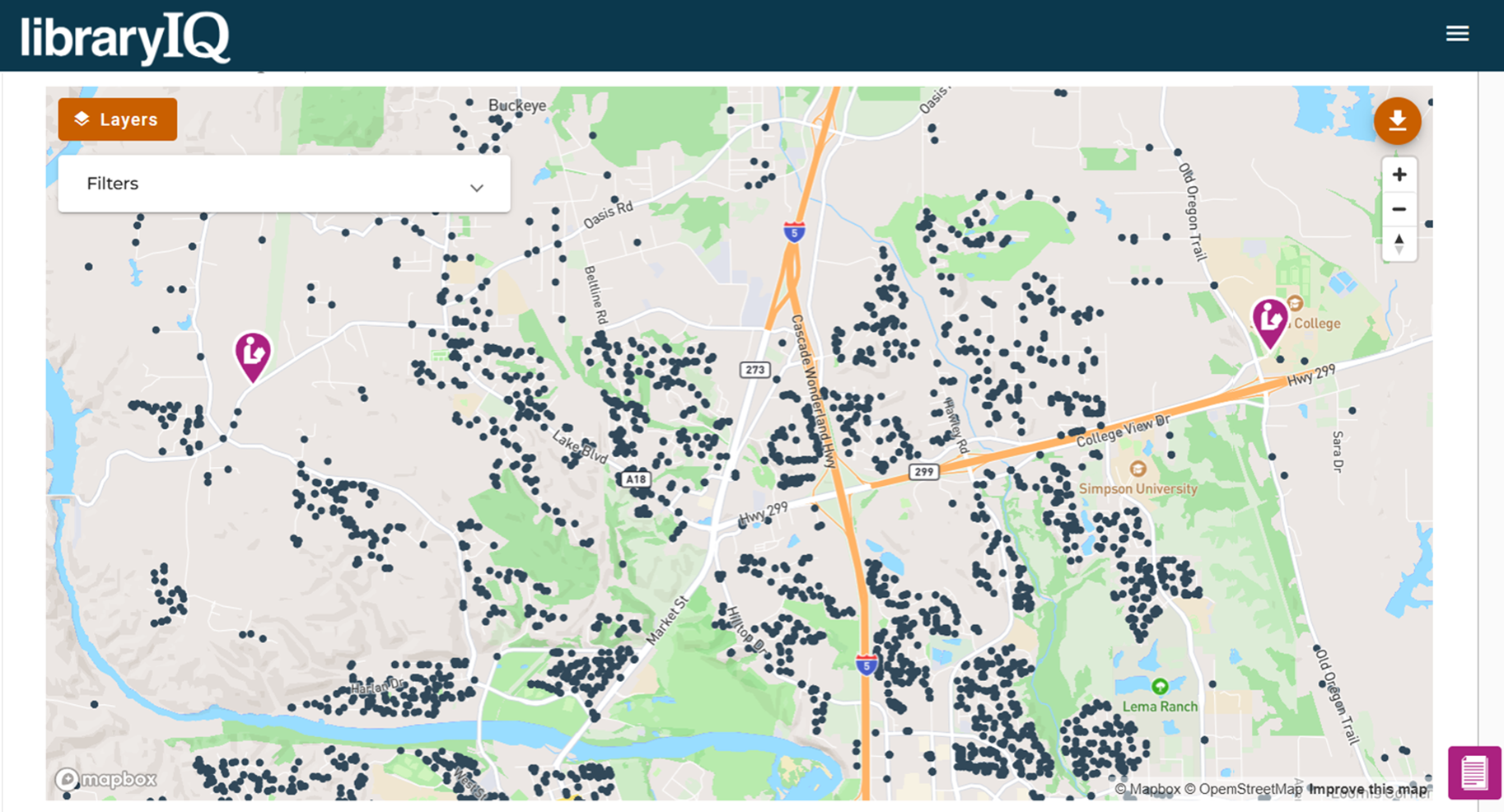
How the Community Map Works
The Community Map shows every registered patron household in your service area.
The bigger the dot, the more that household has checked out in the last 12 months
Zoom in or out to explore individual neighborhoods or your full service area
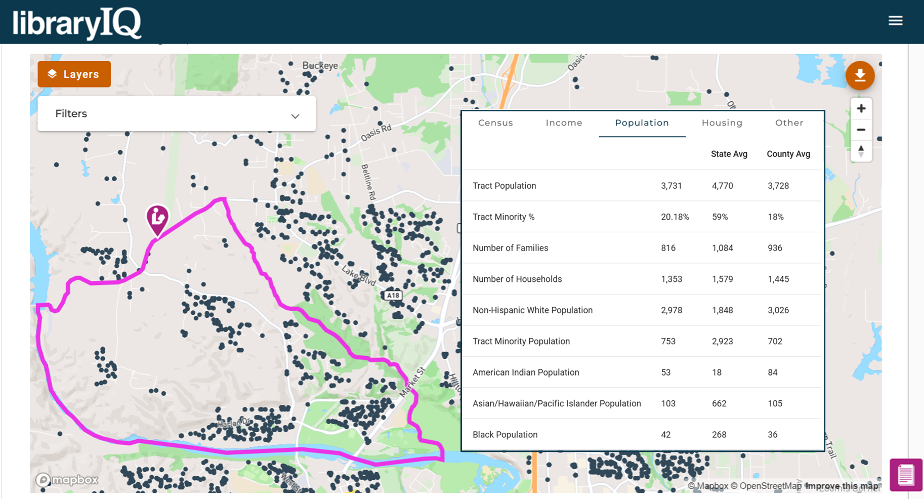
Click a census tract to reveal its demographic profile — helping you compare usage with community characteristics
A simple but powerful way to visualize who you’re reaching, who you’re not, and where to focus your efforts.
Smarter Filtering for Smarter Insights
Filter your Community Map view by key patron data to:
Identify your most active patrons
Measure the impact of outreach or marketing efforts
Pinpoint where usage is growing or needs attention
These filters make the Community Map an even smarter tool for driving outreach and engagement.
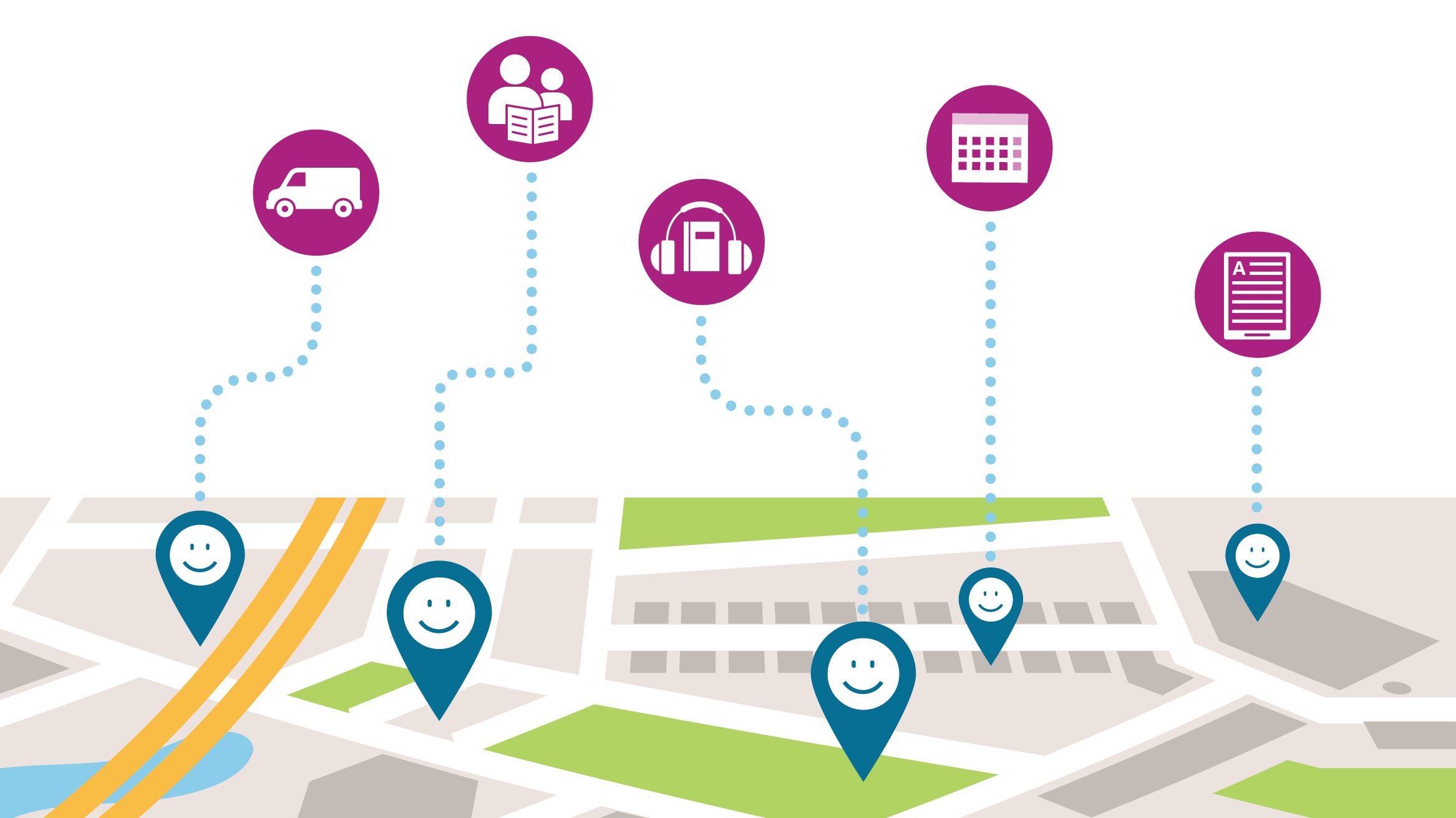
Map Your Own Program & Service Data
Upload your own data and see it mapped by household.
Visualize participation across your community for things like:
eMaterial usage
Storytime attendees
Bookmobile visitors
And more
This level of mapping makes it easier than ever to understand and expand your reach.